Fernbill
A conversion-focused landing page for a fictional invoicing and payment-reminder SaaS for small service teams.
Concept project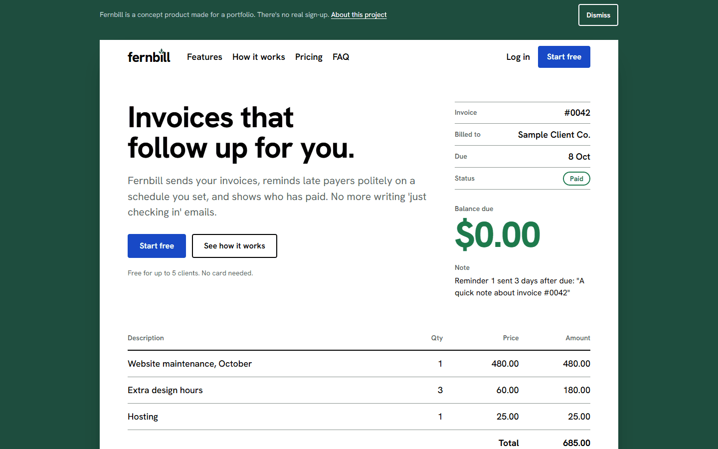
The problem
Small service teams (design studios, development shops, bookkeepers, clinics) invoice dozens of clients a month and dread writing the “just following up” email. A tool that sends the invoice, chases late payers politely and shows who has paid has to explain itself in five seconds, show its price clearly and make signing up feel low-risk.
This is a concept project: Fernbill is a fictional product with no customers, logos or reviews. The page shows the structure a real SaaS landing page needs.
What I did
The page is the invoice
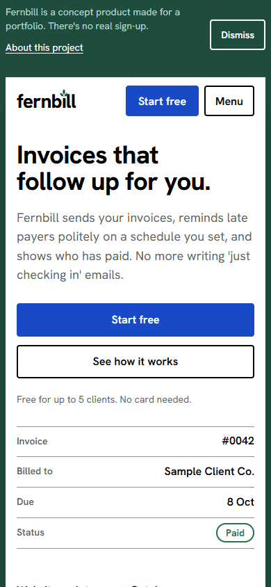
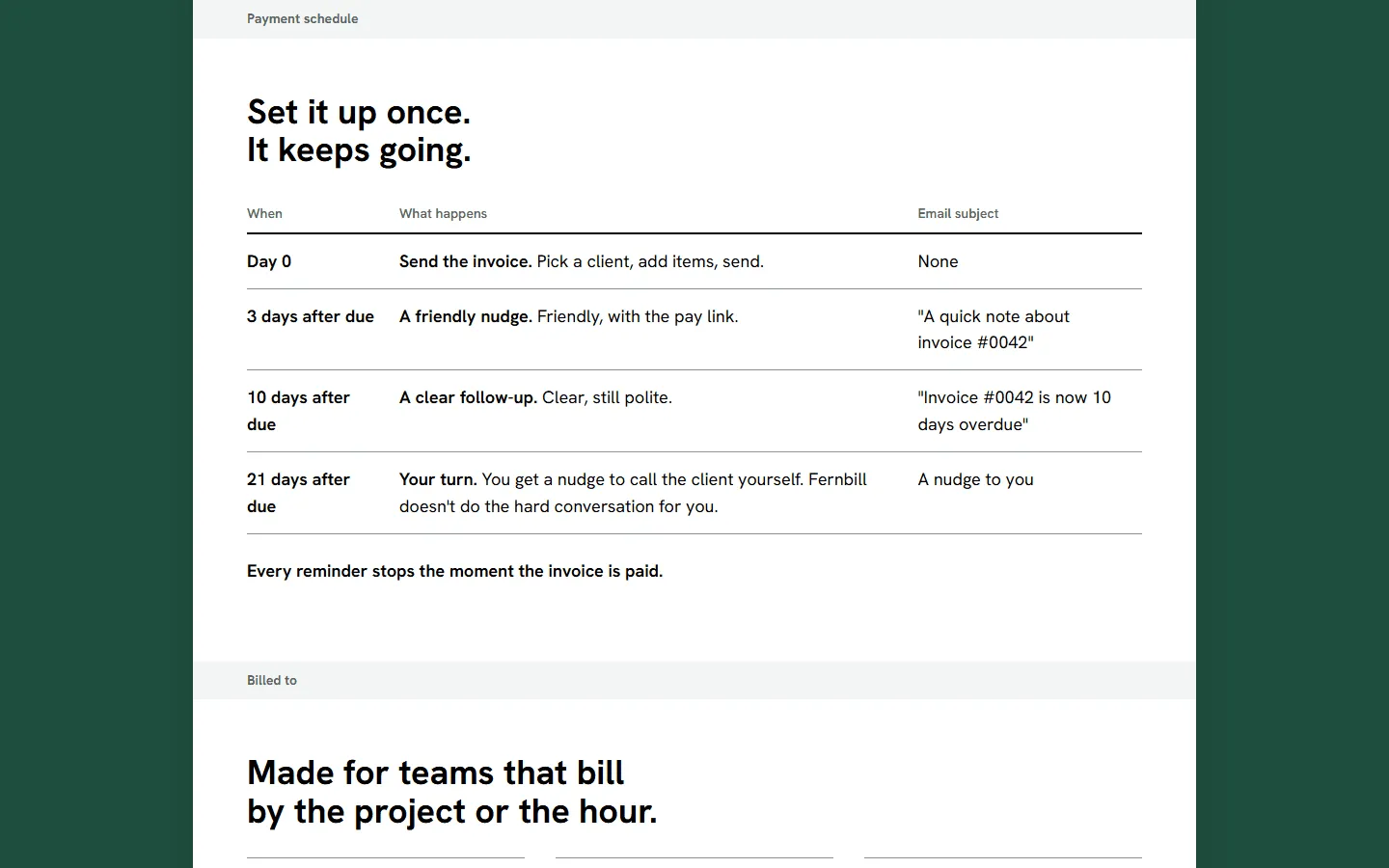
The whole site is one white invoice sheet on a dark green desk. The hero is the invoice itself, with its meta block, line items and balance due; each section is a named part of it (line items, payment schedule, billed to, totals, terms and notes), and the sign-up is a tear-off slip below a dashed perforation. It is all HTML and CSS, so it weighs almost nothing. Once, after a second, the status changes from Overdue to Paid and the balance due rolls to $0.00. The page is light only, by design.
Social proof that stays honest
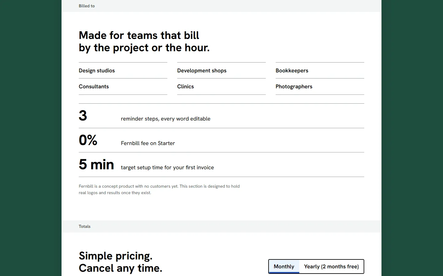
A fictional product has no customers, so the proof section shows who the product is for and facts about its own design. It is built to hold real logos and metrics later, and renders nothing if it is switched to live mode with no content.
Pricing you can switch
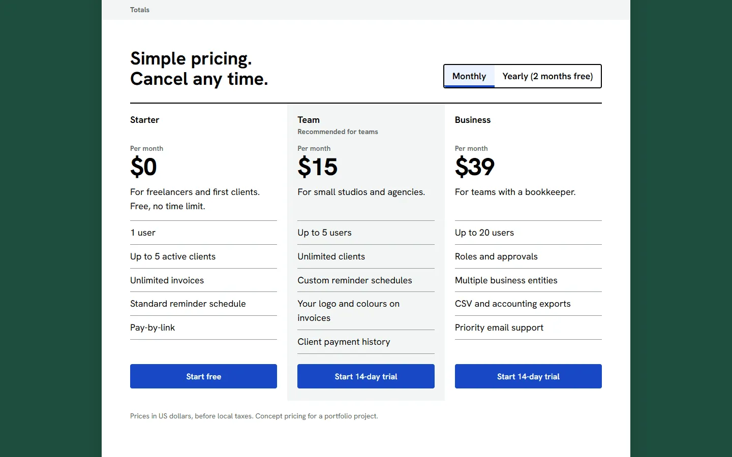
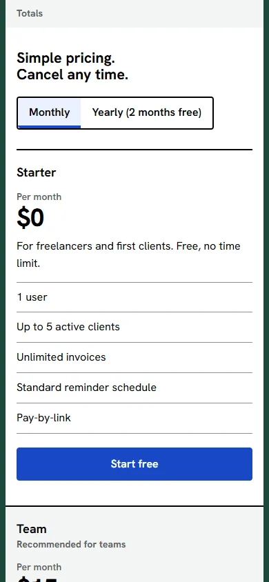
A monthly and yearly toggle updates all three plans and announces the change to screen readers. The recommended plan is labelled in text, not just by colour.
Built with
- AstroStatic HTML with almost no JavaScript, so the page is readable before any script runs.
- TypeScriptTyped pricing data and a content flag that switches the social-proof block between concept and live modes.
- HTML, CSS and SVGThe product visuals are built in markup, not screenshots, so they stay sharp and cannot be mistaken for a real company's data.
Results
- Performance: not measured yet.
- Accessibility: not measured yet.
- Best Practices: not measured yet.
- SEO: not measured yet.
- Page weight: not measured yet.
- LCP: not measured yet.
Scores appear here only once they are measured, dated and linked to a report.
Concept projects show technical results only, because there are no real customers to measure.
Screens
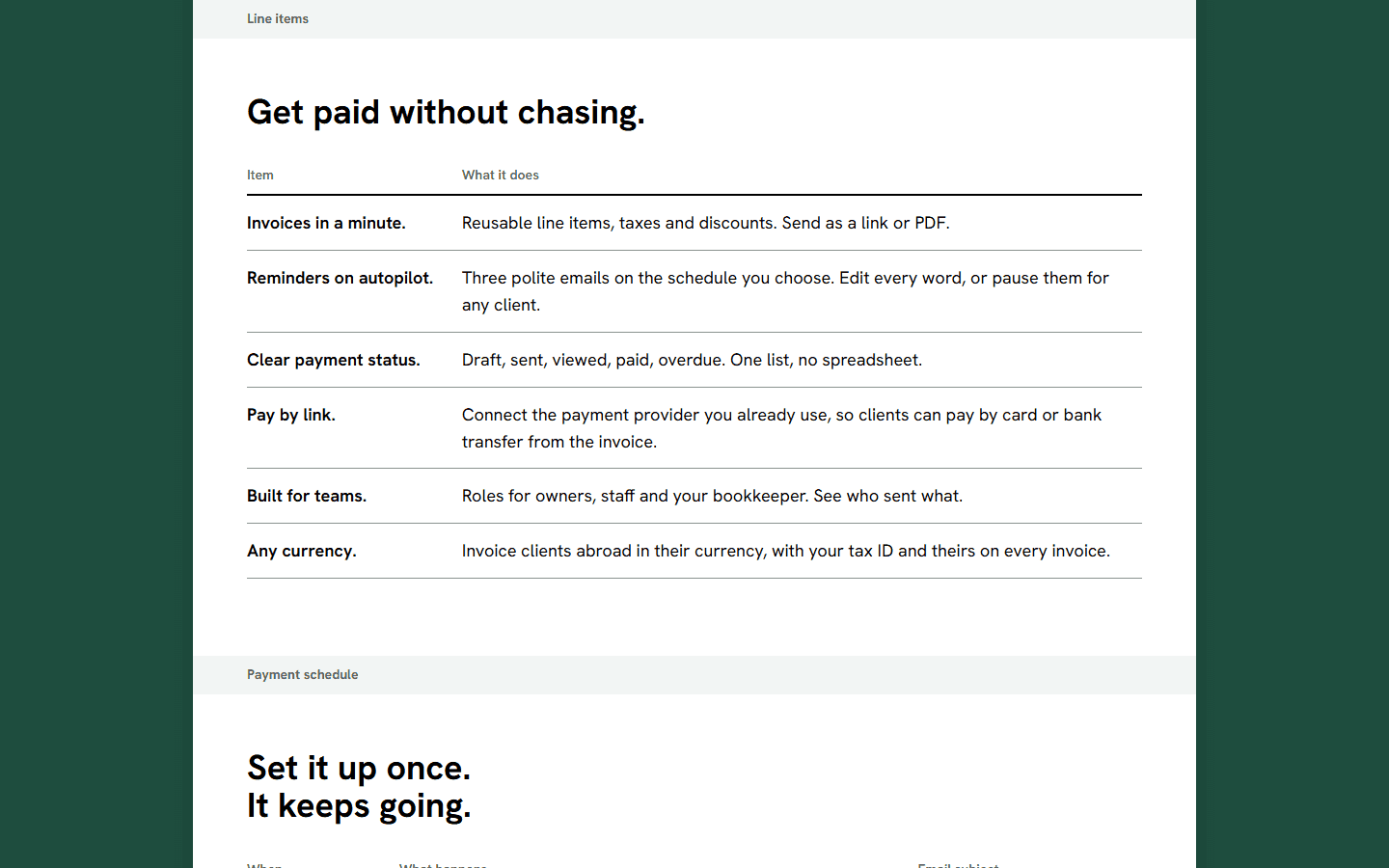
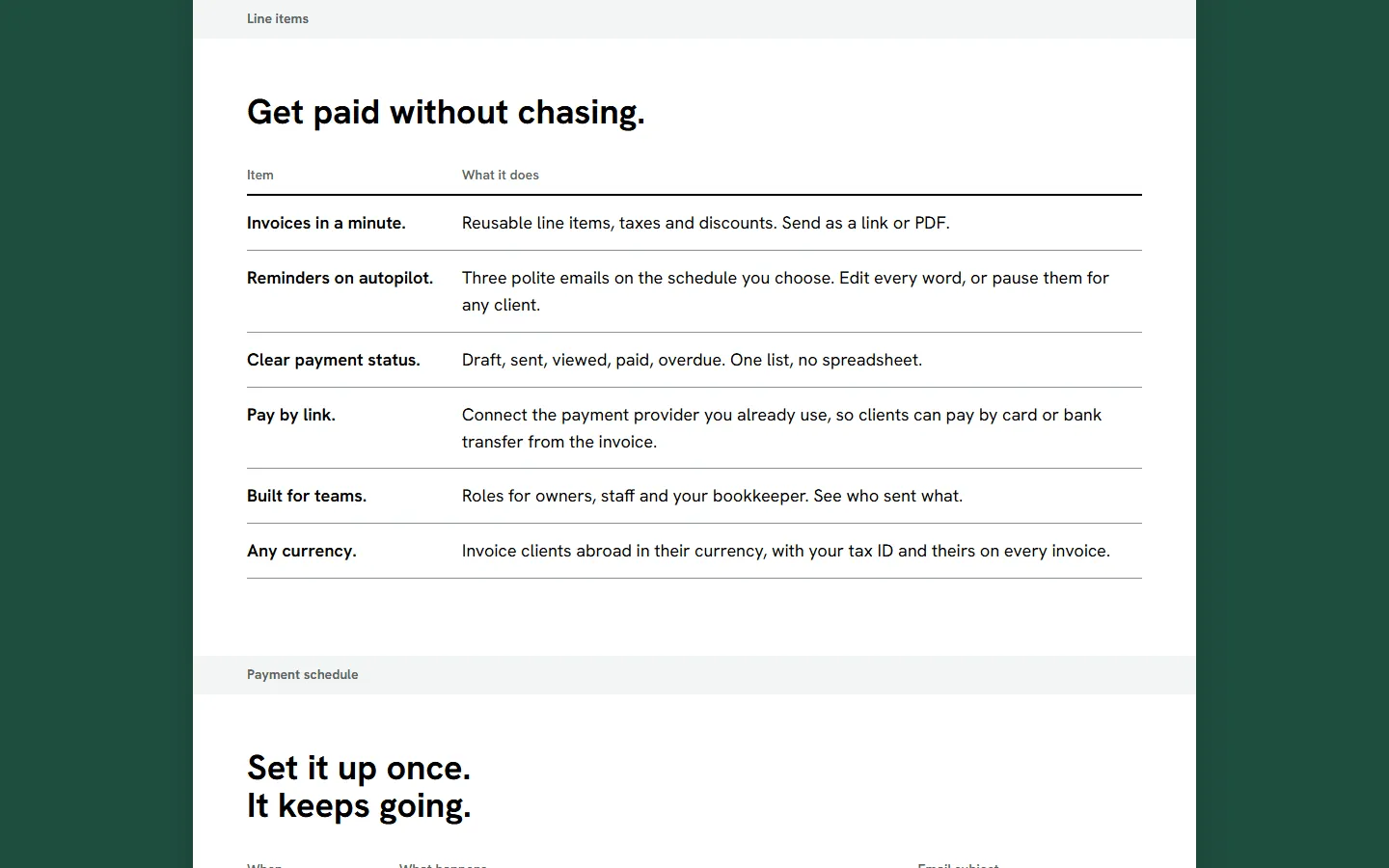
Line items, 1440 px
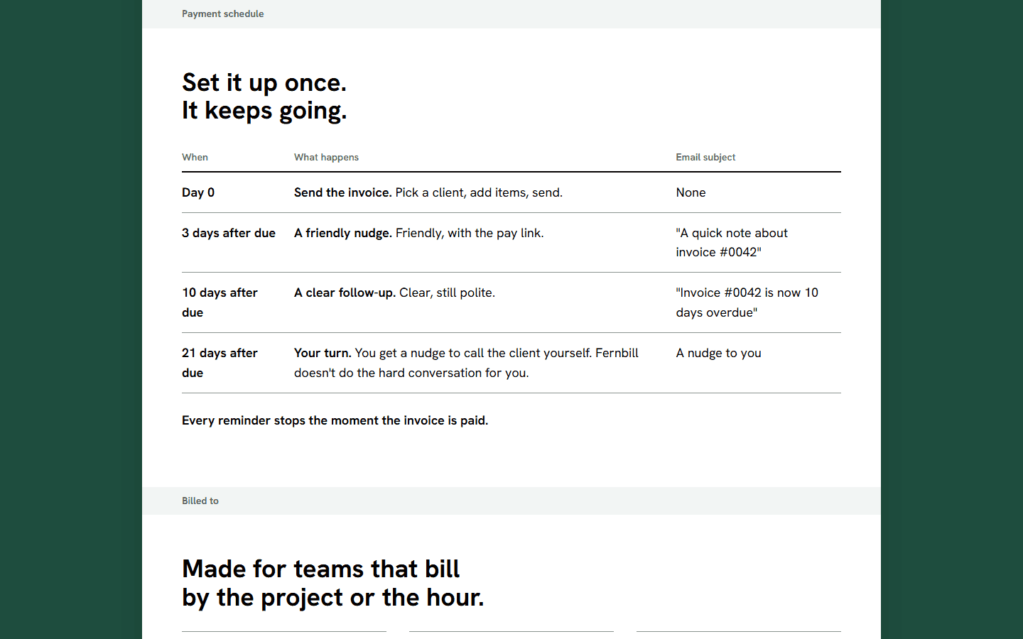
Payment schedule, 1440 px
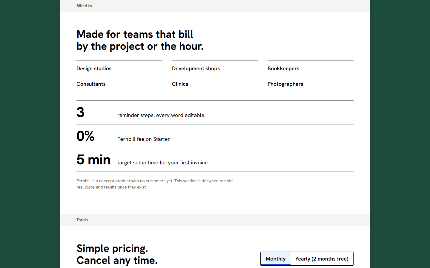
Who it's for, 1440 px
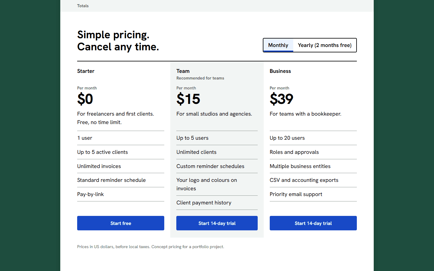
Pricing, 1440 px
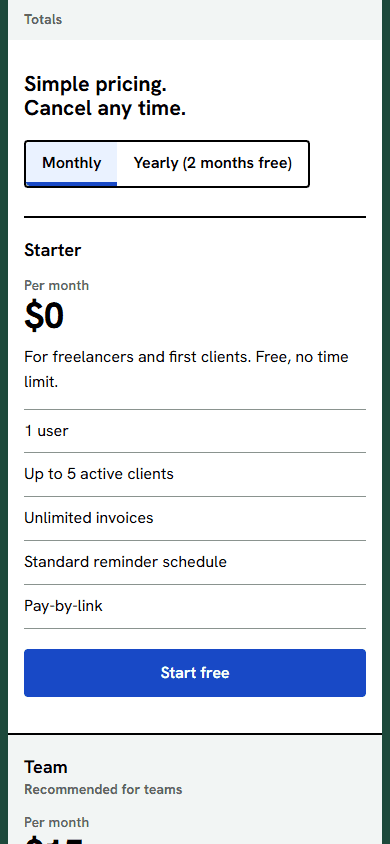
Pricing, 390 px
If this were a real engagement
- Connect the sign-up form to a real mailing list or product back end.
- Add real customer logos and metrics to the proof slot, each with written permission and a source.
- A/B test the hero headline once there is traffic to measure.
linya.ibaocchristian.com
A portfolio and inquiry site for a fictional three-person interior design studio in BGC.
Have a project in mind?
Tell me what you need. I reply within one business day, usually sooner.